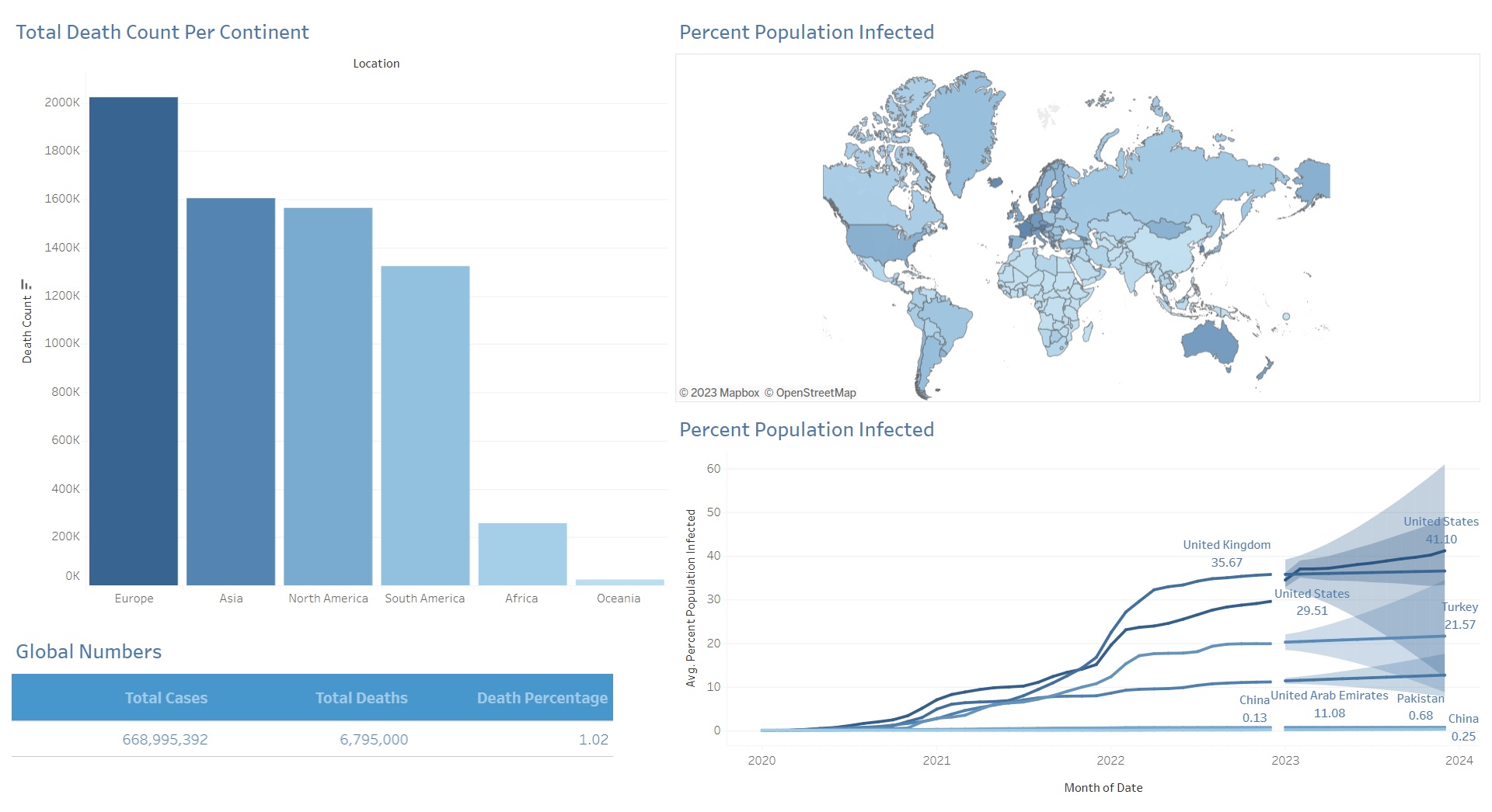
Covid-19 Upto Date Dashboard
Project details
Description
Summary:
This project involved analyzing and cleaning data related to COVID-19. The data cleaning and formatting were done using SQL, and the data was then imported into Tableau to create a dashboard. The dashboard shows the percentage of the population infected on a map, the percentage of the population infected over time with a future projection, and global numbers of total cases, total deaths, and death percentage. Additionally, total deaths per continent are shown in a bar chart format.
Methodology:
To clean and format the data, several SQL queries were used. The first query selected all the data in the Covid Deaths table and ordered it by the third and fourth columns. The second query selected the data that would be used and ordered it by the location and date. The third query calculated the mortality rate for each location and ordered the results by the location and date. The fourth query calculated the infection rate for each location and ordered the results by the location and date. The fifth query showed the countries with the highest infection rates and ordered the results by the highest infection rate. The sixth query showed the highest COVID mortality rate by country and ordered the results by total deaths. The seventh query showed the continents with the highest COVID mortality rate and ordered the results by total deaths. The eighth and ninth queries showed the continents with the highest infection rates.The project also involved calculating the total population versus vaccinations. The first query selected data from the Covid Vaccinations and Covid Deaths tables and ordered it by the location and date. The second query used a Common Table Expression (CTE) to perform calculations on a partition of the first query's results. The third query used a temporary table to perform calculations on a partition of the first query's results.
Findings:
The dashboard created displays the percentage of the population infected on a map, the percentage of the population infected over time with a future projection, and global numbers of total cases, total deaths, and death percentage. The dashboard also displays total deaths per continent in a bar chart format. The SQL queries used in the project helped to clean and format the data, as well as calculate the mortality rate and infection rate for each location. The queries also showed the countries and continents with the highest infection rates and COVID mortality rates. The project also involved calculating the total population versus vaccinations.
Conclusion:
In conclusion, this project involved analyzing and cleaning data related to COVID-19 using SQL and Tableau. The resulting dashboard provides a comprehensive view of the pandemic, including the percentage of the population infected, total cases and deaths, mortality rate, and infection rate for each location. The project also involved calculating the total population versus vaccinations. Additional data sources and visualizations could be added to provide further insights into the pandemic.
Other Projects